Red Brick Ale:
Award-Winning Packaging with Southern Charm
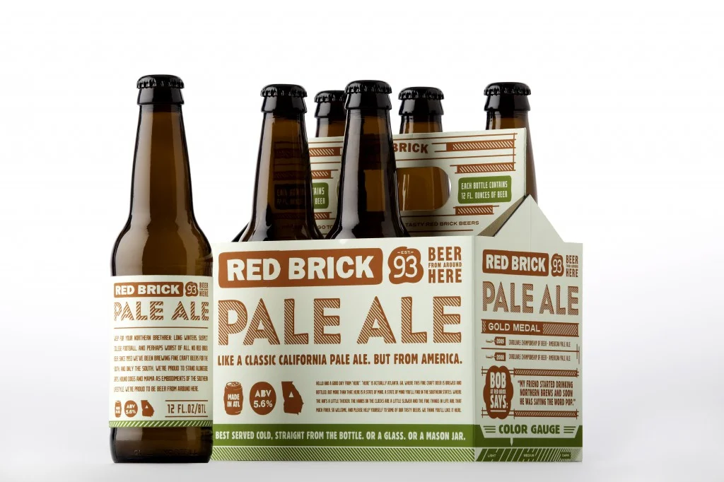
We took on a ground-up redesign of Red Brick Ale’s brand identity and packaging, reimagining every detail to appeal to the modern, sophisticated Southerner—the kind who appreciates good storytelling as much as a well-crafted beer.
From typography to tone of voice, the packaging was designed to stand out on shelves and entertain through all six cans, with clever copy that invited drinkers to linger a little longer with every sip. We leaned into Southern wit, heritage cues, and bold visual language to reflect the personality of the brew—unpretentious, flavorful, and proudly crafted.
The result? A design that didn’t just turn heads—it earned national recognition, landing a coveted spot in the 2010 Communication Arts Design Annual and a feature at The One Show in 2011. Judged by some of the most respected creative leaders in the industry, these accolades are considered among the highest honors in branding and design.
This project proved how the right combination of brand strategy, packaging design, and storytelling can elevate a regional product into an icon with national appeal.